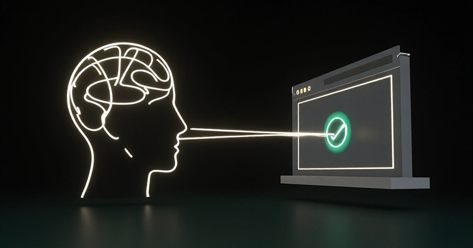
01. FIRST IMPRESSIONS
Above the Fold Mastery
This is where 80% of your conversion rate is won or lost. When someone lands on your website, that first look is everything. This is where users truly decide if they stay or leave.
Goal: Make the visitor stop scrolling, feel intrigued, and believe "this is for me".
Headline
Your Headline is the conversion hook. Grab attention instantly and clearly tell visitors what your page is about. It's like the big, bold title of a book—it needs to make users stop, look, and think.
Function: Point out the main value, be super specific, and speak to the pain or desire of your ideal user.
Result + Timeframe + Credibility
"Double Your Leads in 14 Days."
Pain + Promise
"Struggling to Get Sales? Here's How to Fix Your Website."
Direct + Clear
"Get More Conversions from Your Existing Traffic."
Subheadline
Its job is to add depth and context to your headline, forming the bridge that pulls your ideal user from "Hmm, interesting" to "Tell me more." It's the crucial second punch that lands the message.
Function: Expand on the headline's promise, add urgency or exclusivity, and lead to the next step.
How It Works Expansion
"Our blueprint shows you exactly what to change on your site."
Problem/Solution Reinforcement
"We uncover the exact psychological triggers your site is missing."
Benefit-Driven Urgency
"Use the same strategy top brands use for their 'Above the Fold' mastery."
Hero CTA
This is where you convert interest into engagement. The design, text, and placement are critical to guiding the visitor to their next logical step.
Function: Be the unmissable next step, clarify the immediate outcome, and reduce friction.
Immediate Benefit
"Unlock 2X More Leads"
Low Commitment Next Step
"Watch the Demo"
Problem-Solved
"Start Getting Sales"
Psychological Priming Techniques
Think of it as laying down a mental pathway, making your message feel inherently "right" or "inevitable."
Function: Subtle tweaks to shape perception subconsciously.
Self-Identification
"Made for busy founders who hate low conversion rates"
Loss Aversion
"Stop losing visitors who could have converted"
Scarcity & Exclusivity
"Instead of: Aggressive "Only 3 left! Buy now! banners. Think: Limited Beta Access, Curated Collection"
Reflection Strategy
Use your headline & subhead to "enter the conversation already happening in their head" - Eugene Schwartz.
Function: Use the language target audience would use, refer to real pain or desired future state.
Doubt + Inevitable Solution
"Why Your Website Feels Like a Leaky Bucket."
Frustration + A Better Way
"Spending More on Ads, Still Getting Zero Sales?"
Current State vs. Desired State
"You Have the Traffic. You Just Need a Conversion Engine."
Do You Have a Homepage Video? We observed 50+ major brands that A/B tested videos against other elements. Videos performed worse in every case.
Unless your are selling video content, using videos on your homepage is hurting your conversion rates.
02. USER JOURNEY
Guiding Your Users to Conversion
This is where potential turns into profit. When someone lands on your website, and doesn't bounce you've won the attention game. The goal is to turn interest into action, no friction, no confusion, no dead ends.
Navigation
It needs to craft an intuitive journey that anticipates user needs. Navigation is your user's sense of orientation. If it's not clear, they will abandon the journey.
Function: Simplify choices, highlight the CTA, and ensure accessibility.
Focus is Key
"Limit your main navigation to 4-5 items at most."
Use Plain Language
"'Dashboard' or 'My Account' is clearer than 'Portal.'"
Avoid Dropdowns
"Multi-level menus can lead to decision fatigue."
Scroll Strategy
The scroll needs to pull people downward. Great sites don't feel like separate sections—they feel like a journey.
Function: Enforce intuitive discovery and use clear signals.
Visual Cues
"Use 'cut off' elements and similar tactics to signal there's more below."
Progressive Reveal
"Intrigue + Trust + Value Detail + Proof + Action."
Create a Narrative
"Use section bridges like, 'Here is how we actually do it...'"
CTA Placement
Intercept your user at their peak moment of readiness.
Function: Strategically spaced (every 1.5 scrolls), match the moment in the journey, provide value.
After Pain Point
"See How We Solve This"
After Proof
"Get My Free Site Audit"
After Detailed Insight
"Book My Free Review"
The Zen Principle
It's about designing experiences that feel so inherently "right" that the user's focus remains on their task, not the interface itself.
Function: One idea per section, bolded keywords, progressive disclosure
Ma (間 - Emptiness/Space)
Utilizing strategic whitespace to enhance focus and reduce visual noise.
Kanso (簡素 - Simplicity)
Eliminating the superfluous to reveal core functionality and clarity.
Shizen (自然 - Naturalness/Effortlessness)
Crafting flows and behaviors that feel inherently intuitive and unforced.
Fukinsei (不均斉 - Asymmetry/Irregularity)
Achieving visual harmony through subtle imperfections and unconventional layouts.
Yugen (幽玄 - Profundity/Subtlety)
Suggesting depth and inviting discovery through understated design.
Datsuzoku (脱俗 - Freedom from Habit/Breakthrough)
Introducing innovative elements that delight without disorienting.
Seijaku (静寂 - Tranquility/Calmness)
Designing for a calm, distraction-free environment that promotes concentration.
Koko (孤高 - Austerity/Solitude)
Emphasizing individual elements with focused distinction.
Loopback
This is about closing the conversion circle, preventing leakage, and reinforcing cycle of engagement.
Function: Reactivate interest, obstacle redirection, reduce barriers
Identify Leakage Points
Pinpoint exactly where users are abandoning the desired flow.
Motivate
Remind users of the value they were seeking and the benefits of completing the action.
Incomplete Form
Address common reasons for abandonment (e.g., cost, complexity, distraction).
It's a common belief that you should fill your website with social proof. Is it true? We looked at 4000+ testing results from big brands. When it comes to product pages, less is more.
While social proof often helps, in specific contexts, its presence can unintentionally distract or even overwhelm, leading to lower conversions.
03. PERSUASION ARCHITECTURE
Influence for Irresistible Action
It's about making the desired action feel not just logical, but inevitable to the user. This is a deep dive into pathways of decision-making, guiding users through subtle, powerful psychological triggers embedded directly into your website.
Goal: Overcome doubt, deepen belief, and move the user emotionally and logically towards saying "yes".
Value Proposition Layering
Present your offering as connected layers of benefit, addressing conscious desires, underlying needs, and unspoken aspirations. It's about revealing increasing depth of value as the user engages.
Function: Primary value prop, supporting value props, outcome framing
What You Get
Real time CRO audits
Why it Matters
Fixes prioritized by impact
What that means for you
More revenue
Objection Handling
Your job is to answer before they ask. This preemptively dissolves skepticism and fears, not with a dismissive FAQ section, but by subtly embedding reassurance directly into the flow of information.
Function: Address common concerns before they become barriers and build anticipatory trust.
Objection: Price
"Achieve ROI in less than 3 months."
Objection: Difficulty
"Designed for absolute beginners."
Obikjection: Applicability
"Customizable templates for every industry."
Proof Stacking
Proof stacking is the strategic layering of diverse, undeniable evidence throughout your site, creating an overwhelming cascade of validation that leaves no room for doubt.
Function: Cater to rationalists (data), empaths (stories), and conformists (numbers).
Numerical Proof
"Used by 100,000+ businesses."
Expert Proof
"Logos of major media mentions."
Customer Story Proof
"Short, impactful video testimonials."
Risk Reversal
Make users feel in control, not like they are taking a leap of faith.
Function: Remove the "what if it fails?" mental block, communicate your belief in your own offer, make the "yes" easier by removing barriers.
Ironclad Money-Back Guarantee
Try it for 30 days, no questions asked. Full refund if not delighted.
Free Trial / Freemium Model
Start your free 14-day trial – no credit card required.
Performance Guarantees
If you don't see X results in Y time, we'll [specific action].
Exceptional Support
24/7 dedicated support to ensure your success.
Transparent Terms
Clearly state policies, privacy, and what happens post-purchase.
Belief Bridge
This is the subconscious connection: aligning your product or service not just with their needs, but with their deeply held self-identity, their aspirations, and the person they want to become. The purchase becomes an affirmation of self.
Function: Make the offer resonate with who the user perceives themselves to be or aspire to be, connect the product to their desired future state, foster a feeling of belonging or empowerment.
Identify Aligned Language
"Yes, I want to increase conversions without redesigns"
Aspirational Language
"For the leader who refuses to settle."
Community & Belonging
"If you are the kind of person who... this is made for you"
Could mentioning "AI" in your headlines actually hinder conversions? We tracked testing results across many SaaS brands. Turns out mentioning "AI" often leads to lower conversion rates.
04. CONVERSION UX
Conversion Truth
A user who's ready to convert will still bounce if the experience is frustrating.
Goal: Overcome doubt, deepen belief, and move the user emotionally and logically towards saying "yes".
Form Design
It needs to be welcoming, intuitive, and reassuring, minimizing perceived effort and building trust at every field. A poorly designed form is a silent killer of conversions.
Function: Only ask what you need, break long forms into steps, smart defautls and autofill
Clear Error Messaging
"Please enter a valid email address (e.g., name@example.com)." (Not just "Error.")
Progressive Disclosure
"Tell us your email to start." (yes. Industry size, annual revenue - wait until later)
Autofill & Hints
"Save Time = Save Conversions"
Logical Grouping
"Group related fields together to make the form feel shorter and more organized."
Small words, massive impact
These tiny bits of text around buttons, forms, and error messages are the subtle whispers that alleviate fear, provide crucial context, and reinforce value at critical decision points.
Function: Alleviate anxiety, reinforce value, guide discreetly
Under "Sign Up" Button
"No credit card required." or "Takes less than 30 seconds."
Near "Download" Button
"Get your free guide. (PDF, 2MB)"
Pricing Clarification
"Billed annually. Cancel anytime."
CTA UX
The design, text, and placement are critical to guiding the visitor to their next logical step.
Function: Create clarity & urgency, manage expectations, reflect immediate value
Action + Result
"Start My Audit" (instead of "Submit")
Benefit-Driven Language
"Unlock Your Savings" (instead of "Buy Now")
Mobile Tap Target
"Ensure buttons are large enough for easy tapping on touch devices."
Above the Fold/Contextual
"Place key CTAs where they align with the user's readiness level on the page."
Soft and hard CTAs
Conversion is often a journey, and effective UX offers a range of commitment levels, gently nurturing users down the funnel by matching the CTA to their current stage of readiness and intent.
Function: Nurture leads effectively, capture interest at all stages, progressively build commitment
Soft (Information/Engagement)
"Preview Example Audit" or "See Case Study"
Medium (Trial/Low Commitment)
"Start Free Trial," "Get a Free Quote," "Request a Callback," "Calculate Your ROI."
Hard (High Commitment/Purchase)
"Get Instant Access", "Start Your Free Trial", "Talk to an Expert", "Add to Cart."
Multi-Stage Funnel
Landing Page (Soft) -> Product Page (Medium) -> Checkout (Hard).
Real Copy Examples
Inspire yourself with proven strong micro-copy options. The masters of conversion know that every word counts, guiding subconscious decisions and reinforcing the journey towards conversion.
Function: Provide concrete application, illustrate best practices, stimulate creative adaptation
CTA Button
"Start My Free Audit"
Field Placeholder
"Paste your homepage (we'll scan it instantly)"
Confirmation Page
"We're analyzing your site. Watch your inbox."
Form Section Intro
"We'll get back with personalized insights."
Micro-Copy Near Button
"Cancel Anytime, No Questions Asked" (risk reversal)
Do simple backgrounds convert better on checkout or register pages? The opposite is often true in B2B SaaS.
We've seen real-world proof from Tom Orbach, head of growth marketing at Wiz, who saw massive conversion lifts up to 25% for MineOS and 94% for MyCase when using non plain options. Similarly, a clear winner for Canva's sign up page was an illustrated background.
05. ADVANCED FRAMEWORKS
Conversion Driven Design
Our approach to web design and development goes beyond aesthetics. We use advanced, data backed frameworks to strategically guide users toward a desired action, turning every visit into a measurable opportunity.
By leveraging the power of frameworks like those listed below, we engineer a seamless and intuitive experience that directly drives higher conversion rates and tangible business growth.